How To Build Trustworthy E-Commerce Product Images With AI-Assisted Scene Design
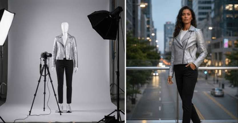
Product images do more than decorate an online store. They help shoppers decide whether an item looks useful, credible, and worth buying. Teams can add AI background to photo workflows to create more visual variations efficiently, but the product itself must remain the source of truth. A polished scene is valuable only when it makes the item easier to understand. Strong e-commerce visuals balance speed, creativity, and accuracy. Whether an image appears on a product page, in a paid ad, or in an email campaign, shoppers should be able to recognize the product, inspect its important details, and understand how it fits into real life.
Why Product Scenes Matter More
Shoppers often form a first impression before they read a description or compare specifications. A useful scene can quickly answer practical questions: Where would someone use this? Does it look compact or substantial? Is it designed for a busy routine, a quiet home, or outdoor use? The goal is not to invent a fantasy around the product. It is to provide visual context that supports a confident purchase decision. Brands also need more image formats than before. One product may need listing photos, category thumbnails, social posts, campaign creative, email headers, and mobile-first ad assets. More images are not automatically better. Every version should have a distinct job, such as proving scale, showing texture, explaining use, or creating a seasonal mood.
The Difference Between A Pretty Image And A Helpful Image
A pretty image may have dramatic color, appealing styling, and a memorable mood. A helpful image makes the product easy to identify, keeps its details accurate, and supports what the page says about it. The strongest product images do both.
- Pretty: Visually striking, colorful, and emotionally appealing.
- Helpful: Clear shape, accurate color, readable details, and useful context.
- Strong: Attractive enough to stop attention, but clear enough to answer buyer questions.
For example, a ceramic mug in a bright kitchen can suggest an everyday morning ritual. However, the mug should still be large enough for shoppers to inspect its handle, finish, shape, and relative size. If the background becomes the main attraction, the image is doing less work for the customer.
Start With A Reliable Product Reference
Scene design works best when the original product photo is sharp, evenly lit, and complete. A high-quality reference gives the editing process reliable information about edges, materials, color, proportions, and surface texture. It also provides reviewers with a reliable baseline for checking the final result.
Checklist For The Source Image
- Capture the entire product whenever possible.
- Use sufficient light to reveal small details and textures.
- Avoid heavy filters, deep shadows, and strong color casts.
- Use an eye-level camera position for most standard products.
- Photograph reflective items from more than one angle.
- Save the original, unedited file before making changes.
Choose The Right Scene For The Product
The scene should connect directly to a product’s genuine use or intended audience. A desk organizer may belong in a calm home office. A reusable bottle may fit a trailhead or park bench. A luxury watch may need a quiet surface, controlled lighting, and very few props. The setting should reinforce the product benefit without changing what customers believe they are purchasing.
Questions To Ask Before Designing A Scene
- Where would a customer realistically use this product?
- What setting reinforces its main benefit?
- Should the image feel clean, warm, active, calm, or premium?
- Could a prop make the product appear smaller, larger, or different?
- Will the composition remain clear on a mobile screen?
Write Better Scene Directions
Vague requests tend to create generic results. Instead, define the setting, surface, light source, camera view, palette, depth, and negative space needed for text. A practical formula is: product setting + surface + light source + camera view + depth + mood + space.
For example: A reusable water bottle on a pale stone bench, soft morning light from the right, eye-level camera view, gentle background blur, cool natural colors, and open space on the left for copy. Keep the direction focused. Too many props can make the scene feel crowded and obscure the product.
Match Light, Scale, And Shadows
Believability depends on visual consistency. Highlights on the product should agree with the scene’s light direction. Soft window light should produce soft shadows, while direct sunlight should create sharper edges. The product also needs a convincing contact shadow so it appears grounded rather than floating.
- Scale: Use familiar props carefully to provide context without misleading viewers.
- Perspective: Match background lines and camera angle to the product view.
- Color temperature: Avoid mixing warm and cool light unless it is clearly intentional.
- Reflections: Check glass, chrome, and glossy surfaces for impossible or distracting details.
See also: Customised Workwear – Empowering Businesses Professional Branding
Keep Product Details Accurate
Accuracy matters more than visual drama in retail. A changed logo, an unreadable label, an added button, an altered fabric pattern, or an inaccurate color can lead to confusion, returns, and lost trust. Compare every finished image with the original reference, especially for high-value or highly technical items. For important launches, ask a second person who did not create the image to review it. Pay particular attention to packaging text, brand marks, ports, handles, closures, jewelry settings, stitching, transparent materials, metallic finishes, and any detail a buyer may use to distinguish one model from another.
Use Catalog Images And Lifestyle Images For Different Jobs
One image style rarely works everywhere. A clean catalog photo is usually best for the main listing image because it makes the product immediately visible. Lifestyle images can add emotion and context in ads, social posts, and email campaigns. Before uploading listing assets, review the product image requirements for Merchant Center to ensure staging, visibility, and overlays do not cause avoidable feed issues.
- Main listing image: A clear product view with minimal distraction.
- Detail image: A close look at material, texture, or controls.
- Usage image: The product in a realistic setting.
- Scale image: The item beside a familiar object or person.
- Campaign image: Expressive styling for a promotion or season.
Review Images Before They Go Live
Quality control should be repeatable, not rushed. First, view the image at full size. Next, compare it with the original product reference. Then inspect edges, transparent areas, labels, reflections, shadows, and contact with the surface. Finally, view the asset on both a phone and a larger screen, because an issue that seems minor on a desktop can become obvious in a small thumbnail. It also helps to show the image to someone unfamiliar with the brief. Ask what product they think it is, where they believe it is used, and whether anything looks unusual. Their first reaction can reveal confusion that the production team no longer notices.
Avoid Misleading Visual Claims
A generated setting should never imply features, ingredients, results, accessories, or uses that the product lacks. Images can create implied claims just as copy can, so teams should ensure visual messages are truthful and supportable. The FTC explains that advertising must be truthful, non-deceptive, and supported by evidence.
How To Measure Whether The Images Work
Measure image performance through product-page engagement, gallery clicks, add-to-cart rate, conversion rate, ad click-through rate, customer questions, and return reasons related to size, color, or expected use. Test one major visual change at a time. That approach makes it easier to see whether a new scene, angle, crop, or detail image actually improved understanding.
Final Recommendations
Trustworthy e-commerce images should be attractive, accurate, and useful, giving shoppers a clear idea of what they can expect to receive. AI-assisted scene design can help teams create more visual variations, test different settings, and produce campaign-ready content faster. Still, it does not remove the need for careful human judgment. Start with a dependable product reference, choose a scene with a clear purpose, and make sure the lighting, perspective, scale, shadows, and reflections work together naturally. Inspect important details such as colors, labels, textures, logos, and product features before publication. When images are both appealing and honest, they can help shoppers make confident decisions, support stronger conversions, and build long-term trust in the brand.